 11

In a strategic move to redefine the visual language of digital teamwork, Atlassian has announced the launch of "Teamojis," a custom-built system of brand emojis designed to enhance expressiveness, connectivity, and human interaction within the professional workspace. This initiative reflects the company’s broader philosophy that the future of work must be more emotionally intelligent and interconnected. By moving beyond standard iconography, Atlassian aims to lead the industry not only through its collaborative software products but through the daily vernacular used by millions of teams worldwide.

The project represents a significant shift in Atlassian’s design trajectory. For years, the company relied on "Tweemojis," an older set of expressive marks that served as the primary vehicle for non-verbal communication across its platforms. However, as the digital landscape evolved and the demand for more sophisticated brand identity grew, the company identified a unique opportunity to create a visually distinctive system. Teamojis are described as a visually cohesive and emotionally intelligent set of marks that reinforce Atlassian’s core values while setting the brand apart in a crowded marketplace of enterprise productivity tools.
The transition involves a two-pronged approach to digital communication. First, Atlassian has deprecated the aging Tweemoji set, replacing it with the more universal Unicode emoji set to ensure broader compatibility and a standardized user experience. Second, and more importantly, the company has introduced the "Teamojis"—a limited, proprietary set of Atlassian-only emojis. These are intended for use within products and in key customer-facing environments, serving as a signature expression of the Atlassian brand.

Defining the direction for Teamojis required an extensive exploration process by Atlassian’s design team. The objective was to create a system that felt both familiar to emoji users and uniquely "Atlassian." This was achieved by focusing on four critical design pillars: color, shape and line, gradient and dimension, and tone.
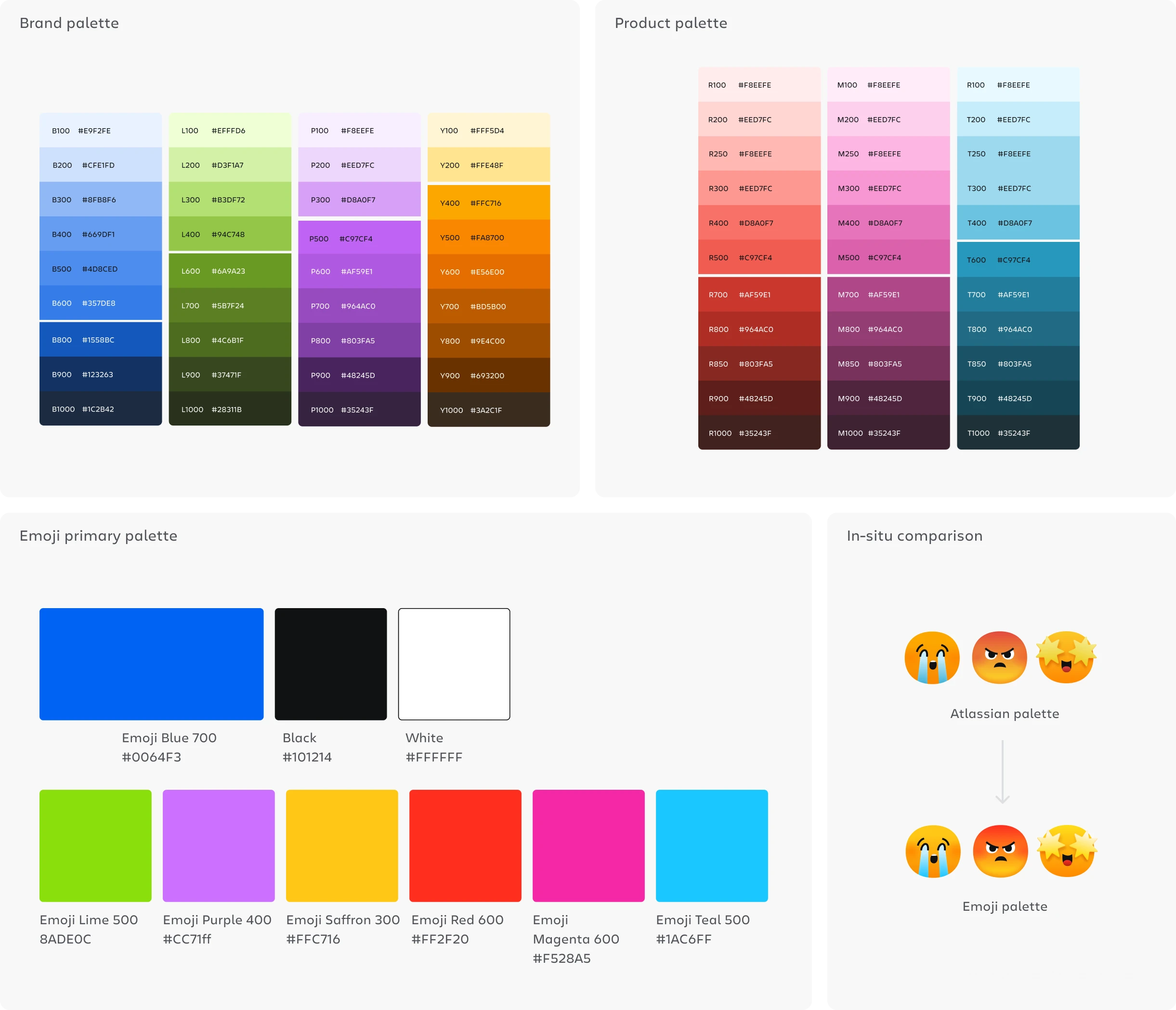
One of the most technical challenges of the project involved the development of a specialized color palette. Atlassian’s design team noted that standard brand palettes often struggle with contrast and vibrancy when reduced to the 16-pixel size required for emoji context. To solve this, the team developed an adjusted "Emoji palette." While based on the primary colors of the existing Atlassian and Product palettes, this new version features increased saturation to ensure the marks remain legible and impactful at small scales. By combining these enhanced primaries with existing tints and shades, the designers were able to preserve the brand’s identity while optimizing for the unique constraints of UI-based icons.

The geometry of the Teamojis is rooted in what the company calls "humanistic geometry." The shapes are derived from Atlassian’s foundation library, which also informs the company’s "foundation spot illustrations." This creates a consistent visual "through line" across the entire brand ecosystem, from marketing materials to in-product interactions. To balance the inherent friendliness of these geometric shapes, the designers utilized squared-off terminals and sharp corner angles in the linework. The lines themselves are untextured and drawn from Atlassian’s established iconography language, a choice made specifically to ensure scalability and legibility across various screen resolutions and themes.
Depth and dimension were also carefully considered to ensure that the Teamojis carry conceptual meaning rather than just aesthetic appeal. Unlike traditional skeuomorphic emojis that attempt to mimic three-dimensional real-world objects, Teamojis utilize a more modern, "flat sticker" aesthetic. Gradients are strategically confined to a range between a primary color and its respective tint or shade. However, exceptions were made for functional reasons; for instance, the "sick" emoji utilizes a lime-to-yellow gradient to communicate a specific physiological state.

To enhance contrast against various backgrounds, the design team implemented shadows that help define features such as eyes, mouths, and contours. This is particularly important for maintaining visibility in both light and dark modes without the need for heavy, distracting outlines. For graphic elements like stars and hearts, the team applied a soft drop shadow that hugs the shape closely, providing a subtle sense of dimension. Furthermore, to maintain palette harmony, the designers avoided the use of pure black for shadows in the orange palette, opting instead for tonal variations that feel more integrated with the overall design.
The final pillar of the Teamoji project is tone. Emojis are fundamentally tools for expression and delight, yet within an enterprise context, they must also maintain a sense of trust and professionalism. Atlassian’s exploration focused on finding the "sweet spot" on a spectrum that ranges from "friendly" to "sophisticated." The goal was to provide a set that allows for high-energy expression and signature moments of delight while remaining appropriate for serious enterprise environments. This balance ensures that a software engineer, a project manager, and an executive can all find value in the visual language without compromising the professional integrity of their communication.
The creative execution of these "signature moments" within the Teamoji set was led by designer Maxwell Hathaway. His work emphasizes the "expressive for delight, professional for enterprise" mandate, ensuring that the animations and static marks feel alive and responsive to the user’s intent.
The move to custom emojis is part of a growing trend among major technology firms—such as Microsoft with its Fluent emoji set and Google with its revamped Noto Emojis—to treat digital icons as a core component of brand equity. By creating a proprietary set, Atlassian is essentially claiming a stake in the "language" of the modern workplace. The company believes that by providing a more human and connected way to communicate, they can foster better teamwork and a more expressive culture for their users.

As work continues to shift toward hybrid and remote models, the reliance on digital communication tools has increased the importance of non-verbal cues. In a physical office, tone and intent are conveyed through facial expressions and body language. In a digital workspace, emojis often serve as the primary substitute for these cues. Atlassian’s investment in Teamojis suggests that the company views these "expressive marks" not as mere decorations, but as essential infrastructure for effective collaboration.
The implementation of Teamojis is expected to be seamless for existing users. By integrating the universal Unicode set alongside the proprietary Teamojis, Atlassian ensures that users have access to the full breadth of standard emoji communication while having the option to use brand-specific icons that feel native to the Jira, Confluence, and Trello environments. This dual-system approach addresses the limitations of the previous Tweemoji set, which had become outdated and lacked the visual sophistication required for a modern enterprise platform.

In summary, the launch of Teamojis represents a holistic reimagining of how Atlassian users interact. Through a meticulous focus on color saturation, humanistic geometry, and a balanced professional tone, Atlassian has created a visual system that is designed to stand the test of time. As the company continues to lead the way in the future of work, these custom emojis will serve as a constant, expressive reminder of the brand’s commitment to making teamwork more human, more connected, and ultimately, more productive. The project underscores the idea that even the smallest visual elements—like a 16-pixel icon—play a vital role in shaping the culture and effectiveness of teams in the digital age.